Repositioning a startup for growth, Tapster expanded beyond its college roots through a complete rebrand and relaunch.
CLIENT
Tapster
Brand Strategy | Naming | Visual Identity | UX & App Design | Campaign Strategy | Launch Marketing
Tapster
Rebrand & Relaunch
INPHANTRY partnered with Tapster to lead a complete rebrand and relaunch. We developed a new name, identity, and product experience, then designed a phased launch strategy built around two distinct campaigns. The approach balanced cultural impact with long-term clarity, allowing Tapster to enter the market with energy and settle into a scalable brand voice.
Our Solution
The problem was never the service itself but rather a problem of perception. Customers valued convenience, reliability, and trust far more than price. To grow, the brand needed to mature without alienating early users. The opportunity was to shift from a college novelty to a trusted, everyday companion for hosting, relaxing, and staying in.
Insight
Tapster launched as Frat Tap, a keg delivery service built for college students. While the product worked and early traction was strong, the name and brand limited growth. It signaled a narrow audience, reinforced seasonality, and made it difficult to expand beyond campus culture. As the product evolved to include full alcohol delivery and broader use cases, the brand became the constraint.
Challenge

The first step was defining what Tapster truly stood for. Through competitive analysis and audience research, it became clear the brand needed permission to grow up. We created a new positioning centered on ease, trust, and control. Tapster's voice encouraged people to see that they didn't always have to go out to enjoy themselves by making staying in better.
The name Tapster was intentionally familiar yet elevated. It retained a connection to the original idea while reframing the service as a role you trust, not a gimmick you try once. From there, we built a flexible visual system and tone of voice that felt confident, playful, and self-aware without leaning into frat culture.
The Rebrand

The rebrand extended beyond a marketing campaign as we also redesigned the app experience to reflect the new identity, ensuring the product felt as refined as the promise. Navigation, UI, and visual language were simplified to reinforce clarity and confidence. The app's design and ease of use became an extension of the brand.
The Product

Rather than a single launch moment, we developed a phased rollout designed to build momentum and then sustain it.
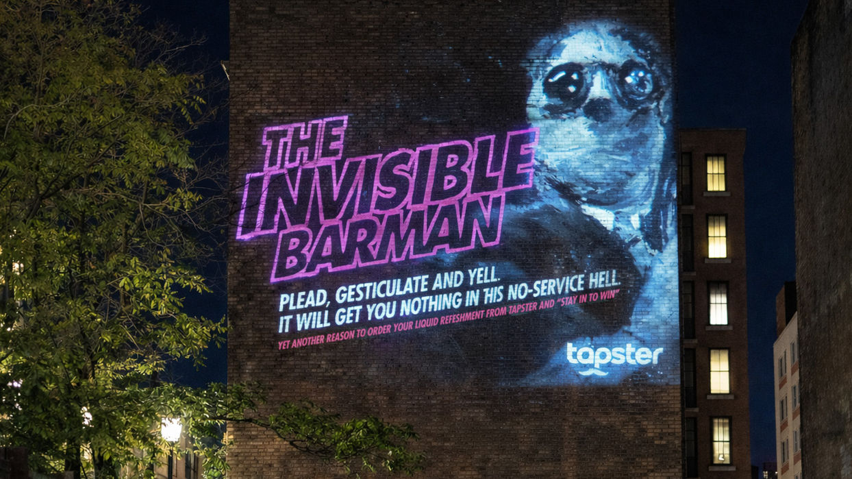
The first campaign, Fear of Going Out, was built for acquisition. Timed deliberately around Halloween weekend, it leaned into shared cultural truths about lines, crowds, and bad nights out. The campaign used bold, horror-inspired visuals and dry humor to cut through the category and stop people in their tracks. For two weeks, FOGO dominated out-of-home placements, wild postings, projection-mapped installations, and targeted digital media across Boston.
Once Halloween passed, the campaign did too.
Immediately following FOGO, all creative transitioned into Tapster’s broader brand campaign, The Business of Pleasure. This phase introduced Tapster in a more universal way, focusing on ease, hosting, and the simple joy of staying in. The tone softened, the message broadened, and the brand settled into its long-term voice.
The handoff was intentional. Attention first. Trust second.
The Launch

The Tapster relaunch marked a turning point for the company. While initially a niche college-focused keg delivery service, Tapster became a brand built for scale. The new identity allowed Tapster to expand its audience, reduce seasonality, and compete in a crowded market without blending in.
Downloads increased, engagement followed, and the brand was no longer limited by its college-focused name. Tapster gained the flexibility to grow into new neighborhoods with new customers and becoming relevant for just about any occasion without the challenges of outgrowing itself again.
Outcome
Next Project:


